2026 Wedding Colour Palettes: 15 Combinations That Work
Your colour palette sets the tone for everything — flowers, stationery, attire, décor, and photos. Here are 15 palettes trending in 2026, with hex codes, seasonal pairings, and real styling advice.
26 March 2026 · 10 min read · Last reviewed April 2026
Key takeaways
- Start with 2–3 colours maximum — one dominant, one accent, one neutral — and build every other decision around that foundation.
- Sage and ivory is the leading palette for 2026, followed by terracotta and olive, and mocha and cream for quieter luxury.
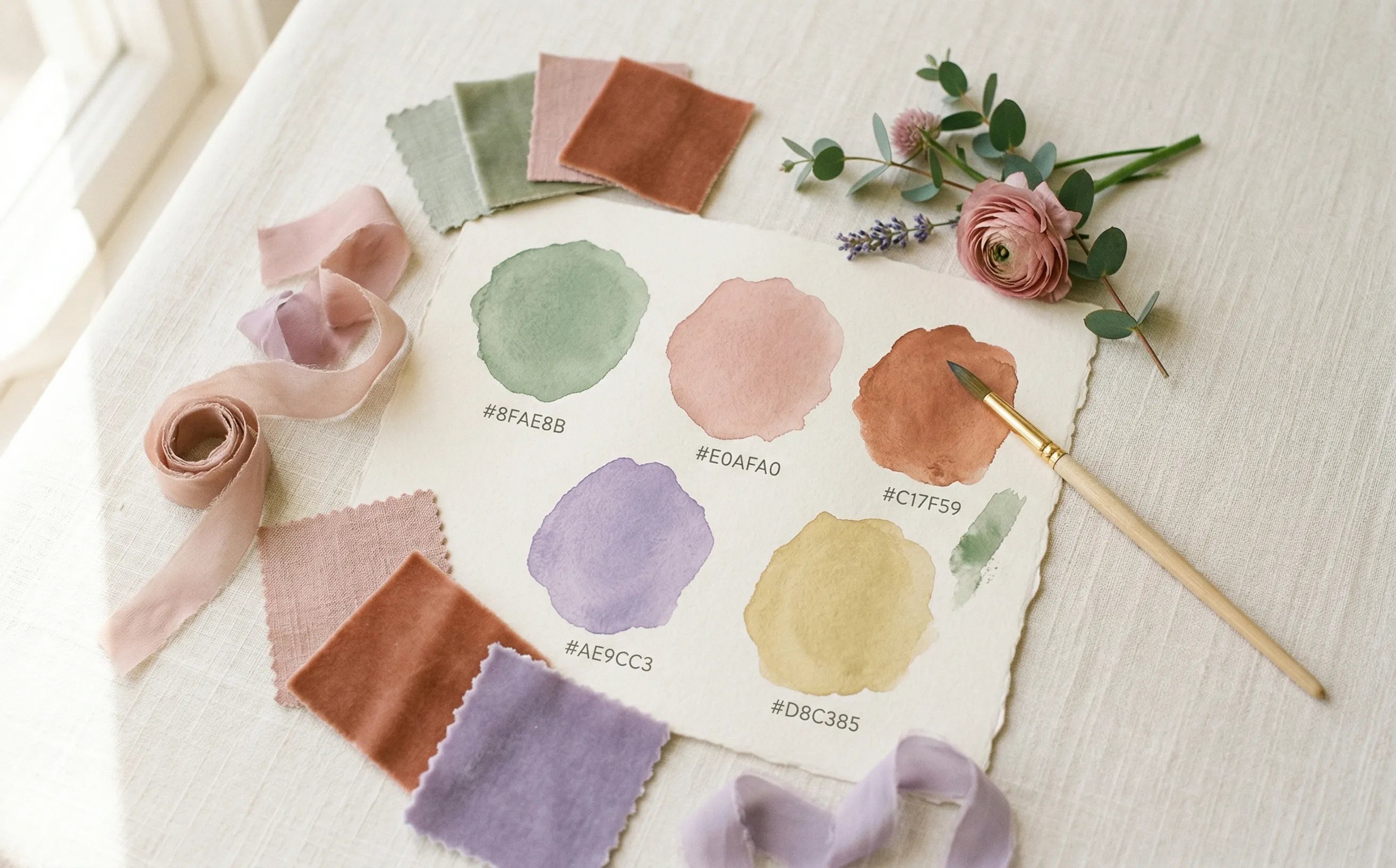
- Share exact hex codes with every vendor — your florist, stationer, and cake designer all need the precise colour values, not descriptions.
- Test your palette in natural light and in your venue’s lighting — screen colours can look dramatically different in photos.
- Your neutral colour should do the heavy lifting on linens, stationery, and backgrounds; accent colours are used sparingly.
How to choose your palette
Start with 2–3 colours, not 5. A tight palette looks intentional; too many colours looks chaotic. Pick one dominant colour, one accent, and one neutral. Everything else follows.
Consider your venue (does it have strong existing colours?), the season (warm tones in autumn, cool in winter), and what flatters your skin tones in photos. Save your favourites to your Ivory Lane vision board as you browse.
1. Sage & Ivory
The palette of the moment. Sage brings calm, ivory keeps it classic, and gold adds warmth. Works in any setting — garden, warehouse, or ballroom.
Best for: Outdoor ceremonies, garden receptions, rustic-elegant venues
2. Dusty Rose & Burgundy
Rich and moody without being dark. Dusty rose softens the burgundy, and cream keeps it from feeling heavy. Stunning in candlelit settings.
Best for: Evening ceremonies, candlelit receptions, vineyard weddings
3. Terracotta & Olive
Earthy, warm, and effortlessly stylish. Feels like a Tuscan hillside. Pairs beautifully with dried grasses, pampas, and natural textures.
Best for: Destination weddings, outdoor receptions, farm and estate venues
4. Lavender & Charcoal
Unexpected and sophisticated. The charcoal gives lavender a grown-up edge. Silver metallics add glamour without competing.
Best for: City venues, hotel ballrooms, modern galleries
5. Blush & Navy
A timeless combination that photographs beautifully. Navy grounds the softness of blush, and gold ties it together.
Best for: Church ceremonies, nautical themes, formal receptions
6. Emerald & Gold
Opulent without trying too hard. Emerald is rich, gold is celebratory, and ivory keeps it from feeling like a Christmas party.
Best for: Ballroom receptions, art deco venues, winter weddings
7. Mauve & Eucalyptus
Gentle, natural, and incredibly flattering in photos. Works with loose, garden-style florals and lots of greenery.
Best for: Garden weddings, greenhouse venues, botanical-inspired décor
8. Sunset Coral & Peach
Fun, warm, and photogenic. Perfect for outdoor summer weddings with golden hour photos. Pair with natural wood and rattan.
Best for: Beach weddings, garden parties, rooftop receptions
9. Mocha & Cream
Neutral, understated, and incredibly elegant. This palette whispers rather than shouts. Works with rich fabrics — velvet, linen, silk.
Best for: Intimate weddings, restaurant receptions, minimalist venues
10. Ocean Blue & Sand
Relaxed, breezy, and instantly evocative. Don't overdo the beach theme — let the colours do the work.
Best for: Beach and coastal weddings, waterfront venues, island destinations
11. Forest Green & Plum
Deep, dramatic, and unforgettable. Feels like an enchanted forest. Pair with lots of candles and dramatic florals.
Best for: Evening ceremonies, historic venues, winter celebrations
12. Butter Yellow & White
Cheerful, fresh, and endlessly photogenic. Feels like a sunny morning in the countryside.
Best for: Garden parties, marquee weddings, country estate venues
13. Minimalist White & Black
Bold, clean, and endlessly chic. Requires strong architectural details and intentional styling to avoid looking sterile.
Best for: Gallery spaces, modern lofts, architectural venues
14. Rust & Mustard
Warm, earthy, and lived-in. The quintessential boho palette. Pair with macramé, dried flowers, and raw wood.
Best for: Festival-style weddings, barn venues, desert landscapes
15. Icy Blue & Silver
Cool, crisp, and magical. Best with lots of candles, crystal, and soft lighting. Avoid turquoise — keep it muted and icy.
Best for: Winter weddings, snow settings, formal evening receptions
Tips for applying your palette
- Share hex codes with every vendor. Your florist, stationer, and cake designer all need the exact colours — not just a description.
- Use your dominant colour sparingly. A little sage goes a long way. Too much and it feels like a costume, not a colour scheme.
- Let the neutral do the heavy lifting. Your table linens, invitations, and background elements should be your neutral tone. Colour comes in as accents.
- Test in natural light. Colours look different on screen vs in person, and different in daylight vs candlelight. Get fabric swatches and check both.
- Coordinate, don’t match. Bridesmaid dresses don’t need to be the exact same shade — mix tones within your palette family for a more natural look.
Save your inspiration
Found a palette you love? Save it to your Ivory Lane vision board alongside venue photos, flower ideas, and dress inspiration — all in one place, shared with your partner.
Sources
- Brides — Wedding Colour Palette Ideas
- The Knot — Wedding Colour Schemes
- Style Me Pretty — 2026 Wedding Trends
Frequently asked questions
How do I choose a wedding colour palette?
Start with 2–3 colours: one dominant, one accent, one neutral. Consider your venue's existing tones, your wedding season (warm tones suit autumn and winter; cool tones suit spring and summer), and what looks flattering on your wedding party in photos. Choose a palette before booking florals, stationery, or attire so every vendor is working from the same reference.
What are the most popular wedding colours for 2026?
Sage green and ivory is the standout palette for 2026 — versatile, organic, and works across all venue types. Terracotta and olive continues to grow in popularity for outdoor and destination weddings. Mocha and cream is emerging as a quiet luxury option. Dusty rose and burgundy remain a strong choice for evening and autumn weddings.
How many colours should a wedding palette have?
Two to three colours is ideal. One dominant colour sets the overall tone, one accent colour adds contrast or depth, and one neutral (ivory, cream, linen, white) ties everything together across linens, stationery, and backgrounds. Adding a fourth or fifth colour tends to make the palette look unintentional rather than curated.
How do you make sure your wedding colours look good in photos?
Test your palette in natural daylight and in your venue's indoor lighting — colours shift significantly between the two. Get physical fabric swatches from your florist or stationer rather than relying on screen references. Avoid neon or very bright tones, which can look oversaturated in photos. Dusty, muted tones (sage, blush, dusty rose, mauve) photograph beautifully.
Do bridesmaids have to match the wedding colour palette exactly?
No — and matching too precisely can look forced. A more natural look is achieved by choosing tones within the same colour family rather than an identical shade. For example, a sage palette might have bridesmaids in different muted greens. This also solves the practical problem of different skin tones and body types requiring slightly different shades to look their best.
Ivory Lane Editorial
The Ivory Lane editorial team covers wedding planning, budgeting, and vendor advice for Australian couples. Our content is reviewed for accuracy against current AU industry pricing and updated regularly.